Blog 09
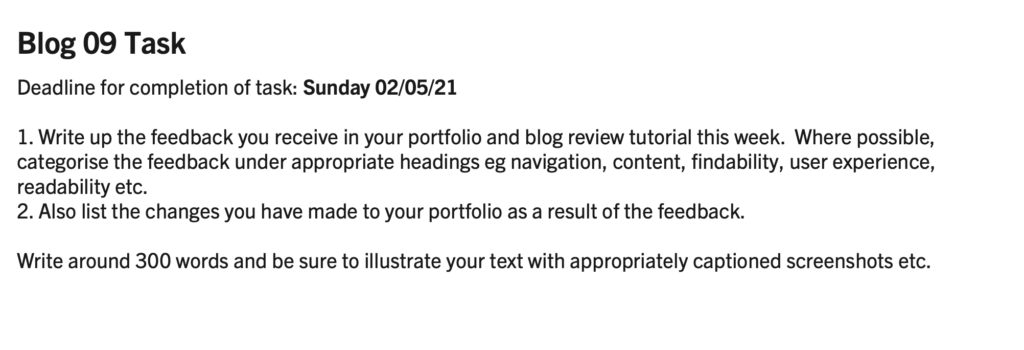
In this week’s tutorial, teachers and classmates appreciate and comment on each other’s web pages. I saw many other students doing very cool things. The following points are what I have learned and need to be modified:
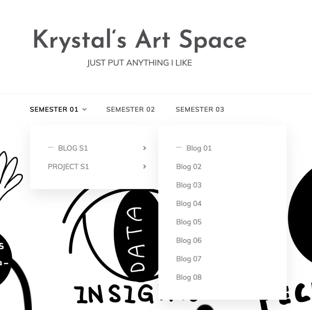
- “Website navigation has an impact on usability and accessibility. It is important enough to ensure its place on this list. When developing a new website or redesigning it, navigation should be the first consideration. Unless you want visitors Browse a page and leave your website. You need to make it as easy as possible for them to find what they want.” Compared with the navigation bars of other students, I didn’t make navigation buttons at the beginning, so I could only search for them on the web. Later, I worked out the navigation settings in the menu, and I redesigned the navigation keys, and Change to a drop-down menu to save inspection steps and user time.
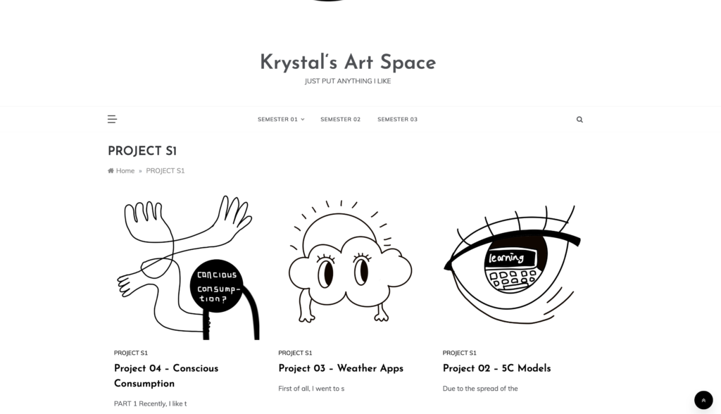
2. In terms of content, my initial article was biased to the left, and the text was not in the center. I didn’t care, the teacher pointed out this problem to me, and I changed it in the settings later. There is also text sorting. At the beginning, my titles were all placed upside down. The teacher pointed out the problem with the reading order, and I also changed the position and placed them in order.
3. Clarity is sometimes achieved through simplicity. My website uses black and white color schemes with simple stick illustrations. Removing noise and clutter on the website will make it easier for visitors to understand the most important information. One of the reasons for using minimalist design is to help improve clarity.
